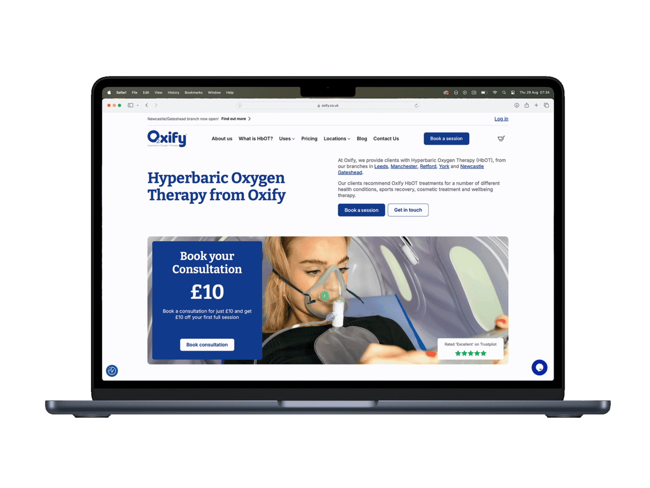
Small Business Website Services: What You Actually Need on Day One
Discover the 2026 business website service essentials with expert guidance…

Every year, the web design industry churns out a list of “trends” that are supposedly going to change everything. AI-generated layouts. Immersive 3D experiences. Parallax scrolling making yet another comeback. And every year, most local businesses would be better off ignoring 90% of it.
I’ve been building websites for businesses across Doncaster and South Yorkshire for years now. I’ve watched trends come, go, and come back again wearing a slightly different hat. So here’s my honest take on what’s actually worth paying attention to in 2026 — and what you can safely ignore.
These aren’t flashy. They won’t win design awards. But they’ll make your website work harder for your business.
This has been true for a decade and it’s only becoming more important. Google’s Core Web Vitals are now a confirmed ranking factor. Your site needs to load in under 2-3 seconds on mobile, or you’re losing visitors before they even see your homepage.
The practical side of this: lighter images (WebP format, properly sized), fewer plugins, decent hosting. None of this is glamorous, but a fast, high-performance site on a £20/month host will outperform a beautiful site on a cheap shared server every single time.
Over 60% of web traffic is mobile. For local businesses, it’s often higher — people searching “plumber near me” or “restaurant Doncaster” are almost always on their phone. If your site doesn’t work brilliantly on a phone screen, you’re invisible to most of your potential customers.
Mobile-first doesn’t just mean “it shrinks down.” It means your phone number is tappable, your forms are thumb-friendly, your text is readable without zooming, and your most important information appears first — not buried below a massive hero image.
The mega-menu trend of the 2010s is finally dying, and good riddance. Most local business websites need five to seven pages. Your visitors want to find your services, see your work, check your prices, and contact you. That’s it.
The best-performing sites I’ve built in the last year all have clean, simple navigation. Home, Services, About, Portfolio, Contact. Maybe a blog. No dropdown menus with 30 options. No clever hidden navigation that requires a tutorial to find. Getting your website layout right is far more important than chasing visual gimmicks.
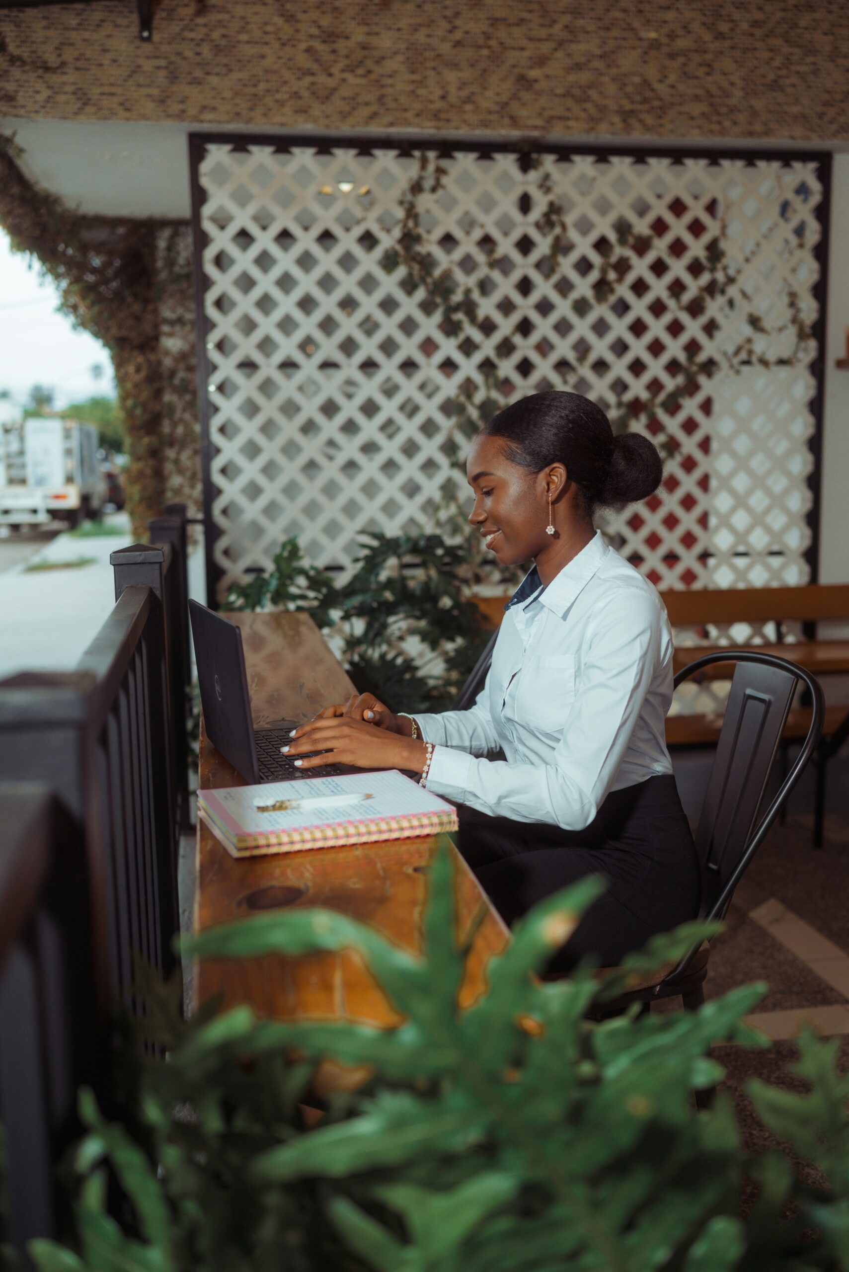
This one’s a real shift. Visitors have developed “stock photo blindness” — they can spot a generic business handshake image from a mile away, and it immediately makes your site feel impersonal. Authentic photos of your actual team, your premises, your work — these build trust in a way that polished stock imagery simply can’t.
Even a decent phone photo of your workshop or your team is more compelling than a perfect stock photo of models pretending to be excited about a laptop. If budget allows, a professional photoshoot pays for itself many times over.
The European Accessibility Act comes into force in June 2025, and UK businesses serving EU customers need to comply. But even aside from legal requirements, accessible design is simply good design. Proper colour contrast, readable font sizes, keyboard navigation, alt text on images — these improvements help everyone, not just users with disabilities.
I’ve started building accessibility into every project from the start. It’s far cheaper than retrofitting it later, and it often improves SEO as a side benefit.
Now for the fun part. Here’s what the design industry is hyping up that most local businesses can safely ignore.
Yes, AI can build you a website in 30 seconds. And it’ll look exactly like every other AI-generated website — bland, generic, and forgettable. The tools are impressive from a technology perspective, but the output is the design equivalent of supermarket own-brand cereal. It does the job, technically, but nobody’s excited about it.
AI is genuinely useful for content drafting, image optimisation, and analytics. But letting it design your entire site? You’ll end up with something that looks like everyone else’s site. For a local business trying to stand out, that defeats the purpose.
Every year, someone predicts that 3D web experiences are about to go mainstream. And every year, they don’t — because they’re slow to load, difficult to navigate on mobile, and completely unnecessary for 99% of business websites. If you’re selling a luxury car or marketing a video game, sure. If you’re a plumber in Mexborough, you need a clear price list and a phone number, not a rotating 3D pipe.
The “intentionally ugly” design trend looks fantastic in agency portfolios and design award submissions. It looks terrible on a local business website where you’re trying to build trust. Your customers don’t want to decode an artistic statement — they want to find your opening hours.
Dark mode is great for apps you use at 11pm. It’s less great for a business website where readability and professionalism matter. If your audience is tech-savvy or creative, offering a dark mode toggle makes sense. For most local businesses, a clean light design with good contrast is the safer bet. Don’t add complexity for the sake of a trend.
If you’ve got a limited budget (and most small businesses do), here’s where I’d focus your investment in 2026, ranked by impact:
1. Professional photography. Even a half-day shoot will give you 50+ images that make your site feel authentic and trustworthy. Budget: £200–£500.
2. Fast, reliable hosting. The difference between cheap shared hosting and a decent managed WordPress host is night and day. Budget: £15–£30/month.
3. A proper contact page. Not a generic form buried on your About page. A dedicated, well-designed contact page with your phone number, email, location, and a simple form. This is where conversions happen.
4. Regular maintenance. WordPress updates, security monitoring, broken link checks, content refreshes. A neglected website is worse than no website — it actively damages your credibility. Budget: £30–£60/month for a care plan.
5. Basic local SEO. Google Business Profile, consistent NAP details, a handful of locally-focused pages. This alone can transform your visibility for “near me” searches. If you’re unsure where to start, our guide on getting found on Google breaks it down.
Here’s what nobody in the design industry wants to admit: the fundamentals haven’t changed much in years. Clear messaging, fast loading, easy navigation, mobile-friendly, good images, obvious contact details. That’s been the winning formula for a decade, and it still is.
What changes each year is the technology available to deliver those fundamentals better. Better image formats. Faster hosting. Smarter caching. Improved accessibility standards. These are the “trends” worth following — incremental improvements to the things that already work.
If someone’s trying to sell you a website redesign based purely on making it look “more 2026,” ask them how it’ll actually improve your leads or sales. A beautiful website that nobody can find on Google or that takes 8 seconds to load isn’t a good investment, no matter how trendy it looks.
Focus on what works. Ignore the noise. Your customers will thank you for it.
At Pixelish, we build websites for businesses across Doncaster and South Yorkshire that prioritise the stuff that actually matters — speed, clarity, and getting you found on Google. No gimmicks, no unnecessary complexity. Just sites that work hard for your business.
If you’re thinking about a new site or want an honest assessment of your current one, get in touch for a free, no-pressure chat.