
Small Business Website Services: What You Actually Need on Day One
Discover the 2026 business website service essentials with expert guidance…

You can usually tell within a few seconds whether a website was built by someone who knows what they’re doing. It’s not about flashy animations or expensive custom illustrations — it’s about layout. The way elements are arranged, the spacing between sections, the visual hierarchy that guides your eye from headline to call-to-action.
A well-laid-out website builds trust instantly. A poorly-laid-out one creates doubt, even if the business behind it is excellent. Here’s what actually makes the difference.
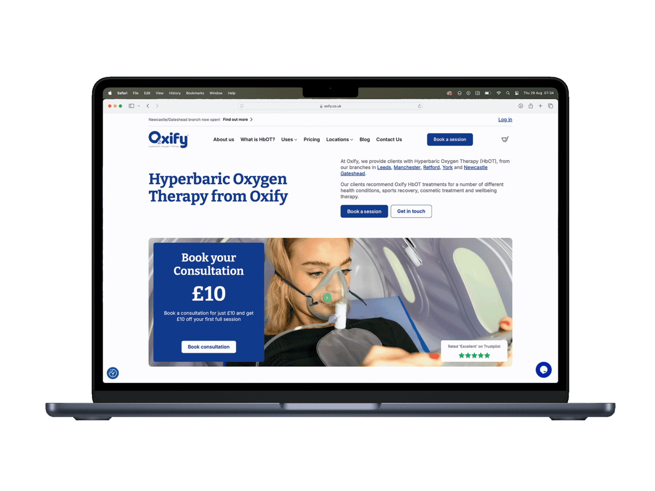
Every effective business website shares a handful of layout principles. These aren’t trends — they’re fundamentals that have held true for years. If you want to see these principles in action, take a look at some brilliant examples of good web design from around the web.
Visitors don’t read websites — they scan them. Eye-tracking studies consistently show that people follow an F-shaped pattern: they read the headline, scan down the left side, and pick out subheadings, bold text, and images. A strong layout works with this behaviour, not against it.
This means your most important message goes at the top. Your headline should clearly communicate what you do and who you do it for. Supporting details come next, followed by proof (testimonials, portfolio, credentials), and finally a clear call-to-action.
The single biggest difference between amateur and polished websites is spacing. Consistent padding between sections, uniform margins around content blocks, and appropriate line height in body text — these create a sense of order that visitors feel even if they can’t articulate it.
A common mistake is cramming too much into a small space. White space isn’t wasted space — it gives your content room to breathe and makes the page easier to process. The best layouts feel spacious without feeling empty.
Every section on your homepage should have a job. Here’s a typical layout that works for most service-based businesses:
Hero section — What you do, who it’s for, one clear action to take.
Services overview — Three to four key services with brief descriptions.
Social proof — Testimonials, client logos, or case study highlights.
About snippet — A brief introduction that builds personal connection.
Call-to-action — A final prompt to get in touch or request a quote.
If a section doesn’t serve one of these purposes — inform, prove, or prompt action — question whether it needs to be there.
You don’t need ten different fonts. You need two at most — one for headings, one for body text — used consistently throughout. Headings should be noticeably larger than body text to create clear levels of information. Body text should be at least 16px on desktop and have enough line spacing (1.5–1.7) to be comfortable to read.
Avoid centre-aligning large blocks of text. It looks tidy in small doses (a testimonial or a single-line heading) but becomes hard to read in paragraphs. Left-align your body copy — always.
These are the issues I see most often when reviewing small business websites. Each one is easy to fix but surprisingly common.
Your homepage hero section has roughly 3 seconds to communicate what your business does. “Welcome to Our Website” wastes that opportunity. A strong headline is specific: “Web Design for Doncaster Businesses” tells visitors immediately whether they’re in the right place.
“Call us! Email us! Fill in this form! Follow us on Facebook! Subscribe to our newsletter! Download our guide!” — when everything is shouting for attention, nothing gets it. Pick one primary action per page (usually “Get in Touch” or “Request a Quote”) and make it prominent. Everything else can be secondary.
Full-screen hero images were trendy a few years ago. The problem? They push your actual content below the fold, slow down load times, and often don’t communicate anything useful. A well-chosen hero image that supports your headline is great. A massive stock photo of a city skyline that takes 4 seconds to load is not. Oversized images are one of the most common causes of poor website performance, which hurts both user experience and rankings.
Buttons that change colour or size from page to page. Headings in different fonts. Spacing that shifts randomly between sections. These inconsistencies make a site feel unfinished, even if the individual elements look fine in isolation. A cohesive design system — where every button, heading, and section follows the same rules — is what separates amateur from professional.
Use this to evaluate your current site or plan a new one. If you can tick most of these, your layout is in good shape.
Homepage
Every Page
Mobile
Different pages need different approaches. Here’s what works best for the most common pages on a business website.
Lead with the problem you solve, not a description of what you do. “Struggling with a slow, outdated website?” is more compelling than “We offer web design services.” Follow with your approach, what’s included, pricing if possible, and a clear next step. Keep the layout focused — one service per page performs better than cramming everything together. If you’re unsure what to include, our guide to what a small business website actually needs is a good starting point.
People buy from people. Your About page should feature real photos of you and your team, your story (brief — nobody needs your life history), and what makes you different. A common layout that works well: photo on one side, text on the other, followed by credentials or milestones, then a call-to-action.
Keep forms short — name, email, message. That’s it for the initial contact. Display your phone number prominently. Include a map if you serve a specific area. List your response time (“We typically reply within 2 hours”) to set expectations and encourage form submissions.
Show your work visually but include context. A screenshot alone doesn’t tell the story. For each project, briefly cover the challenge, your approach, and the result. If you can include a measurable outcome (“increased enquiries by 40%”), even better.
Google can’t see your design, but it can measure how people interact with it. A well-structured layout improves several signals that affect your search rankings:
Layout and SEO aren’t separate concerns — they’re deeply connected. A site that’s pleasant to use tends to rank better because Google’s algorithms are increasingly designed to reward good user experience. We’ve covered this relationship in more detail in our article on the link between web design and SEO.
A strong website layout isn’t about following the latest design trends or using the fanciest tools. It’s about clear communication, consistent styling, purposeful sections, and making it as easy as possible for visitors to find what they need and take action.
If your current site feels cluttered, inconsistent, or isn’t converting visitors into enquiries, the layout is usually the first place to look. Small changes — better spacing, a clearer headline, fewer competing calls-to-action — can make a significant difference without a complete redesign. Before you commit to a full rebuild, it’s worth understanding how much a website actually costs so you can weigh up your options.
Need a hand? At Pixelish, we build clean, structured websites for businesses across Doncaster and South Yorkshire. If you’d like a free review of your current layout, get in touch — I’m always happy to take a look.
